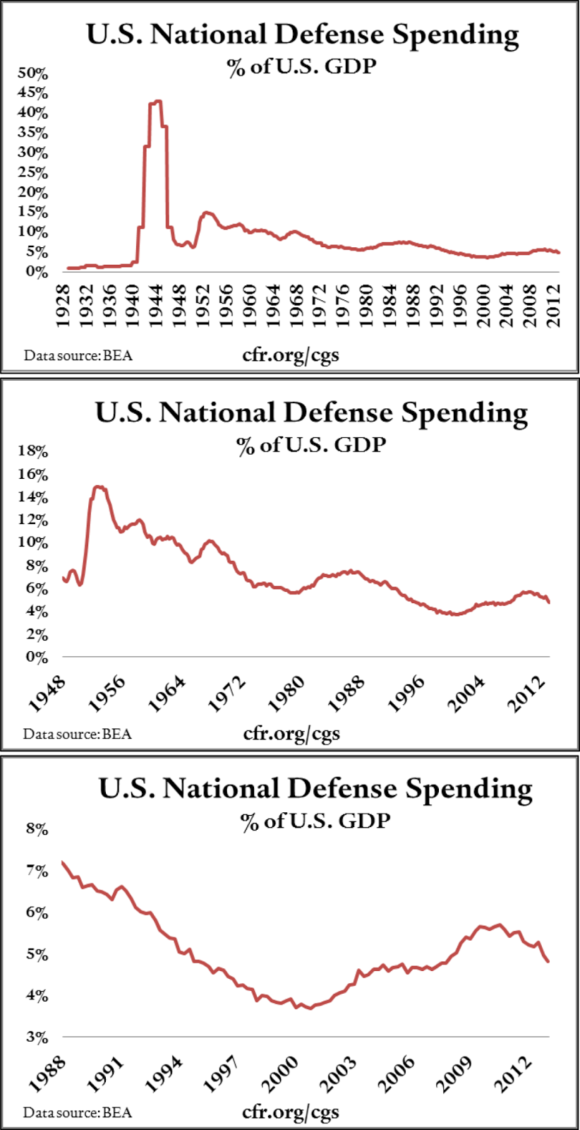
The charts on page 6 of this article from the
Council on Foreign Relations (Walker, Dinah.
Trends in US Military Spending. Council on Foreign Relations, 2013; reproduced below) discuss military spending as a percentage of GDP for the last 80 years. They look closer at the time after WWII and then even closer at the time after the Cold-War. What I find most interesting is that it is so much lower than what I thought it would be. And relative to how much was spent (percentage wise) in the 1940s, it is really incomparable. I’m curious what those dollar figures are.
 |
| From Trends in US Military Spending |
But, looking at the data from the
interactive World Bank site, I can see that relative to other countries, the US spending is higher than most. For example, France spends 2.3% GDP on their military. War torn countries (or their neighbors), including Saudi Arabia (in blue, labeled incorrectly as a second France), South Sudan, Oman, spend the most, around 8% to 10%. But most countries spend below 3% GDP on defense. Our friend Russia spends almost the same amount (4.5%) as the US, which is not too surprising given our continued Coolish-War with them.


No comments:
Post a Comment